Gothic blackletter font for authentic headline and display use
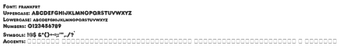
Frankfurt, digitized and released by Dieter Steffmann, is a Gothic blackletter typeface intended for headline and decorative typography. The font reproduces dense, angular blackletter strokes and ornate capital forms, delivering a historical calligraphic voice for posters and branding. It ships as a TrueType (.ttf) file with a standard Latin character set and clean digitization, making it suitable for designers, historical reenactors, and hobbyists who need an authentic medieval look without manual lettering.
What Frankfurt brings to historical typography
The font reproduces traditional blackletter by presenting dense, angular strokes and ornate uppercase characters that emulate German calligraphy. The digitization is part of a historical revival collection and is credited to Steffmann, which explains the emphasis on period-correct letterforms. This design intent positions the font for display roles where a strong, historic headline voice is required rather than neutral text settings.
How much typographic control designers get
Control comes from letterform choice rather than many weights, since the package typically provides a single blackletter style with decorative capitals. Designers shape output by using size, tracking, and case to emphasize ornamentation. Common use cases include:
Headlines and titles
Posters and invitations
Branding accents
The font’s visual contrast supplies stylistic variety, while format compatibility lets it be used across document workflows.
Is Frankfurt easy to install and use across applications?
Installation and application use are straightforward; the typical workflow on Windows is to right-click the .ttf file and select Install, after which the font appears in programs that support system fonts. It works in common design tools such as word processors, image editors, and desktop publishing software. The digitization is described as clean, so render quality suits both print and on-screen display without additional setup.
Does the font fit into multi-platform and licensing workflows?
Cross-platform compatibility is standard
Who should choose Frankfurt for their projects
Frankfurt is a faithful option for designers and hobbyists who want a clear blackletter headline presence; it serves display-level work better than continuous reading text. For practical use, pair it with a neutral sans serif to preserve legibility in mixed layouts and adjust tracking at small sizes. The font best fits projects seeking a historical headline voice while accepting that dense letterforms demand careful typographic handling.
Pros
Authentic blackletter letterforms faithful to German calligraphy
Ornate uppercase characters designed for display headlines
Supplied as TrueType (.ttf) for broad application support
Clean digitization suitable for print and on-screen rendering
Laws concerning the use of this software vary from country to country. We do not encourage or condone the use of this program if it is in violation of these laws. Softonic may receive a referral fee if you click or buy any of the products featured here.